Showing posts with label - Diamine. Show all posts

Sunday, September 7, 2014

Sunshine Yellow - Diamine Ink Review

Hello, my dear pen friends! Sorry for neglecting the blog for a whole four months...I was a little caught up in school, out-of-state internship and studying (more like procrastinating for) board exam (which I passed last week. I am now a certified genetic technologist!). Anyway, let me finish up some queued posts before diving into newer purchases (of course I have never stopped hauling stationery).
I think I need to dust the interior of my camera...Those dots are getting crazy.
Diamine Sunshine Yellow is a golden tangerine yellow that looks like liquid sun in the sample vial. The color is bright and workable as a writing ink (the words don't jump out of page but at least it's not like taking note with highlighter). You can put it in the other way that it's a bit too dark/used as highlighter, too light as a writing ink.
Consistency of Sunshine Yellow is a little on the watery side, at least there is some slip that writing was as smoothly as most other Diamine inks. Shading was wonderful on a Clairefontaine grid notebook and water-resistance is none-existent (a few drip and you will get a whole patch of yellow smear). Overall it seems interesting to try out but there is very little practicality (unless you do calligraphy with it using a flex nib).

Thursday, April 24, 2014

Wild Strawberry - Diamine Ink Review

 The related picture of the day is that of (according to Trees of Texas plant identifier, this is) yaupon.  (How in the world can I manage to take enough good pictures of strawberries, without gulping them all right away?)
 Diamine Wild Strawberry is a rich and succulent orange-red that gears towards the intense side. The color is very much like fresh strawberry that's not yet ripe (when they ripe, you get more of a purple red) and the color is bright, spring-like without being obnoxious.

Flow wise, it's quite typical of Diamine - Watery (not lubricating in anyway but it neither feathers nor bleeds) but not thin and writes smoothly with a Lamy fine steel nib. In a way, it feels a little squishy like biting into a fresh tomato (does it even make sense?).
When you are dealing with a bright and intense ink, it's best not to expect too much shading, I get a little of it anyway (that's only when I actively look for it). As for water-resistance, there is none. I was drinking ice tea while taking notes (on the other side of this, the DNA and restriction enzyme was for an exam cram a week earlier) and the whole writing the dissolved completely.   

Overall: A fresh note-taking (used alone or as an accent) color and a delight to use during the sunny Texans spring (when summer hits it would be all hot and sticky, and I will roll out my aqua blue...)
One more picture of the fruity tree


Writing sample is Rihwa's Last Love (the lyrics doesn't make too much sense but at least the melody was nice)

Wednesday, April 9, 2014

Prussian Blue - Diamine Ink Review

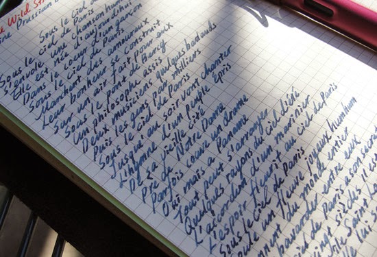
Long time no ink review (well, the sun hasn't been out that often this year). Diamine Prussian Blue is a medium slate blue with a mildly watery consistency. I picked the color because it looks just like the color of the German music publisher G. Henle Verlag (One would always gets some glance of approval from professors/TAs if you carry the blue book around the practice room ). Even without the connection with that prestigious publisher, it still seems like an interesting subdued shade for everyday uses. 
Prussian blue - as with may gray-toned color, is watery, smooth on the paper (Daolin/writes-like-Rhodia refills that fits the bigger Midori traveller's, which btw mine is not...) and shades very well with a Lamy medium steel nib. There is very minimal feathering (on the start of writing which tend to be wetter) and no bleed-through but I guess it would be different on more porous paper. The dry time was ok, maybe within 15 second and the ink withstand like spill of water, just not smear/soak.
Writing sample was Edith Piaf's Under the Parisian Sky (if you Google Parisian sky, most pictures are in this kind of slate blue...and that MAC eyeshadow of the same shade). 

Wednesday, July 17, 2013

Kelly Green - Diamine Ink Review

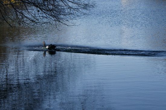
Friendly Neighborhood Duck
 
Another green from Diamine. Kelly Green is a medium-deep (intensity-wise) green that's neutral to slightly yellow. It's able to shift from fresh early-summer leaves to the peels of Granny Smith apples, in a short and fine stroke. As with all Diamine inks I have tried, there is no feathering/bleed through (even on cheap copy paper)and Kelly Green itself has little-to-no water-resistance. 

The ink is generally very well-behaved but I notice some crumbs forming around the feed and between the tines (same thing happened with Diamine Meadow), keep that in mind if it bothers you.
Taken under indoor artificial light (it has been raining all week) 
Scanned picture of the handwritten review (on a Rhodia No. 11 Pad)

Thursday, May 23, 2013

Diamine Eau de Nil Ink Review

 
All I have is  "Eau de Texas"
Continuing on with the Diamine ink sampling - Eau de Nil is a medium-deep (the shade is on the deep side while the ink has a medium intensity) dusty teal with quite a bit of green to it. The shade is rather moody,  as it reminds me of the cover of Harry Potter and the Order of Pheonix (published by Scholastic. I remember the Canadian one has a different cover illustration that I don't like as much). 
Diamine Eau de Nil with Ohto F- Lapa Fountain Pen
 Like the rest of the Diamine inks I have tried, the flow is good and it write smoothly for an ink with such watery consistency. I experienced a little bleed-through and feathering with Moleskine and cheaper paper but none on Rhodia. Shading is good (only on Rhodia) but for some reason, I prefer it uniformly deep (a sheer layer dusty aqua just makes me uncomfortable). Water resistance is decent as the writing is still legible after a 10-second smear. Basically, the paper falls apart before the writing does.

Overall: A well-behaved ink (most deep ink bleed/feather on cheaper paper anyway). The color isn't quite my thing as I prefer something a little brighter, more opaque and teal that are more blue-toned.
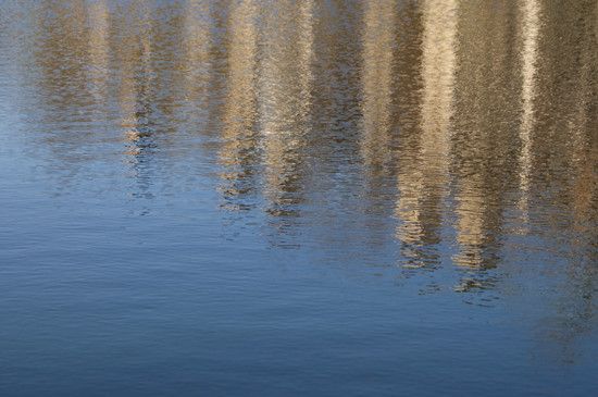
Another picture of the lake, just because...

Sunday, March 17, 2013

Diamine Meadow Ink Review

Green fish (made of nephrite) overseeing grassy area - The closest thing to meadow among my pictures
 
Diamine Meadow - Look at the shading (with an EF nib!)
Here is a short green ink review for the St. Patrick's day (it's weird that I love the color green but I don't really care about this day...Anyway, I hope the McDonald Shamrock Shake will still be available for a few more days). Speaking of green stationery, I want need a pen in this color (Lamy Apple Green is a bit too light/neon)...
 
 Meadow is just like the other Diamine I have reviewed - Flows reasonably well (not as good as Pilot and Sailor but the unit price is a lot more wallet-friendly), has a nice medium intensity, no feather or bleed through with this cheap paper and Lamy EF combo. The yellow-green looks quite refreshing and it's one of the better shaders from what I have tried.
Just realized that I really like how my handwriting look with fine steel nibs like Lamy EF
  Anyway, I bought the sample from Isellpens and the whole range of Diamine inks is on clearance in Jetpens (Meadows is sold out already = _= ) for a little over 10 bucks per bottle. I am trying hard to not get tempted (I always ended up with too many random junk while trying fill the 25-dollar free shipping threshold)....

Friday, March 8, 2013

Cerise - Diamine Ink Review

The azaleas are blooming!   
Pink ink for spring -  Diamine Cerise is a vivid medium blue-pink that looks like a standard pink highlighter when diluted (I didn't bother to dry the pen completely so there was water in the feed). With thicker/more layered stroke, there is also a bit of flamingo/bright orange tone to it, especially as it dries. I noticed an allover golden/yellow sheen on the surface of the water as I was cleaning off this ink (too bad the sheen is not visible on paper).

 I think this is a wonderful choice for demonstrator pen (the pink Kaweco Ice Sport comes to mind) as it's non-staining and looks like fruit punch as it's sloshing in the ink vial. 
Diamine Cerise has a decent shading with the medium Lamy Al-Star, excellent flow, non-feathering and no perceptible lubrication (but again, I don't need any with the pen). There is tad bit of water resistance, as long as you wipe the spill ASAP, you will still be able to read the writing (but it's helpless with soak).
 
I am not sure if you can tell from the base on the nib (should have taken a picture on the other side...), Cerise leaves a layer of powdery pink deposit allover the tip of the feed, as well as some yellow sheen around the side (since the feed is somewhat blueish, the sheen ends up looking green). It was a little strange since I syringe fill the converter but I guess since it all got wiped away, there was no biggie.
 
Overall:  I really like the color (probably because I love this shade of lipstick/gloss?) even it's a little bit too neon for daily use...And I think I might need a full bottle once I run out my 3ml sample.

Wednesday, February 27, 2013

Violet - Diamine Ink Review

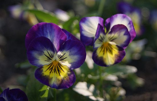
Violet flowers - I think these are called field pansy
Color/Intensity - Diamine violet is a medium-deep purple with a bit of a blue lean. As it's drying, the ink shifts from a mid-tone purple to a slightly fainter blurple (and stays that way), not unlike the gradation on the field pansy. The color is not too bright, deep enough to be easily legible but it doesn't have inky/blackened quality to it.

Shading- with a medium nib (Sailor Sapporo H-M, which kicked Lamy F out and became my default writer) the shading is noticeable but just not in a mind-blowing way (purple-blue shift doesn't count). 

I suppose everything shades better with broad/wet/italic nib but I personally like using fine-medium for ink review. Not only they happened to be my most-used nib, they are also pickier on the inks.