Showing posts with label Fountain Pen. Show all posts

Tuesday, September 1, 2015

Pelikan Souveran M400 White Tortoise - Broad Nib

"Wait. You bought half a ski worth of pen!?"  
That was the reaction from my friend/temporary roommate(who bought a whole ski around the same time, huh huh.)when I confessed to her my darkest secret. By the way, I did so with a happy and smug face, just like her dog/roommate no.2 when she ate my lunch/chewed up my makeup brush.

I have owned and used this pen for almost 9 months already and I guess it's time for a short review.
 
Pelikan M400 White Tortoise is one of the pens that had been on my list forever, and as soon as I got my second paycheck from my grown-up job (the first/ the whole thing,  was to take care of the rent and deposit. The joy of living in New York area), I went online and hunted this baby down.

The reason of my strong desire is quite apoarent: Look how pretty and shiny it is!

There are plenty of pictures of the white tortoise on the net so I won't go all spammy: In real life, it's just as beautiful (as it was in my day dream). The white pen has a simple design with gold accent.

The acrylic barrel, where most ooh-and-ahh is induced, has warm toned striations that glitter and flicker under sun. This kaleidoscope-like beauty is further enhanced with inks in shades of yellow, amber and orange. 
The grip section of the M400 is short but long enough to rest on my finger without running into the thread. Anyway, the well-balanced pen is lightweight enough that it wouldn't cut into skin even I am holding onto the thread. 

For the nib, I picked up a broad (mainly because my appetite for pin-point precision can be fulfilled by the Japanese). It's less stiff than the 14k from Sailor but a tad springy than the stainless nib from Lamy. It writes well, in a smooth and sheer way that showcases shading in lighter ink but admittedly, I can't say it's better writer than pens in cheaper price brackets.
Writing sample with Diamine Jade Green on Muji grid notebook. It took me months to use up the barrel full of ink now that I no-longer have notes to take and my actually handwriting has to be done with ballpoints. The horror.

Overall: It's a beautiful pen and a decent writer. I can't say it's worth all the Benjamins but it has been making me really happy. If you want a more expensive pen with a solid performance and tangible craftsmanship, I think a Pilot pen in the 100-dollar range will bring you more joy.

Friday, September 26, 2014

MonteVerde One Touch Tool Fountain Pen

 Monteverde One Touch Tool *, a fountain pen with several functions built-in, is the first of its kind that I have ever tried. My first impression was how streamlined the pen looks, the metal body (seems like brass) is spray painted silver and it's hexagonal through out with minimal obstruction. There four rulers integrated into the body: 1/100m (standard metric), 1/200m, 1/300m and one in English system.    
The two sides left are occupied by a level and a clip that's stiff but springy enough to be easily attach to shirt pocket. Just keep in mind that the pen is heavy, long (might not fit shirt pocket) and the nib will be facing down (leaking potential).

Thursday, October 24, 2013

Ohto F-Lapa Fountain Pen with Fine Nib & Gold Accent

Ohto F-Lapa Fountain Pen with Fine Nib and Gold Accent (only available at Jetpens) was purchased not too long after I got the F-Spirit (even though I enjoy using the pen, the body was too heavy and chubby for my liking). The F-Lapa is slim, classy looking even better-received in the customer review section (just the black-gold version though). I reckon for 16.5 bucks, this is would be a wonderful addition in my messy bag.
The nib is exactly the same as that of Ohto F-Spirit and same gold-toned one with some squiggly patterns. The print "Fine Iridium Point Germany" was etched on it but I guess it's most likely made in China (because I have a Chinese promotional pen with the same thing on it, it's a good writer though).  The grip section is quite small, slim and made of an unknow material that resemble both hard plastic and rubber.Over the course of one year, it has built a little patina (OK, oil built-up) and got a little glossier and more plastic like.
The model number and name are printed by the edge of the cap (which is easier to take off than the F-Spirit but still fits securely). The gold band behind the grip, for some reasons, shows significantly more wear than the rest of the pen (which holds up really well even after a year of frequent use/abuse).

The small size of F-Lapa is perfectly comfortable (evening after being posted) and the metal body makes it weighty enough to rest in my hand. The nib is stiff as a whole but the tip is smooth and lays down a concentrated fine line (between Lamy EF and F, thicker than most Asian fine nib) that makes watery inks appear more saturated. Overall: If you have small hands and like steel nib with no flex, this is a pretty good pen for the affordable price.
  Writing sample of F-Lapa and Diamine Violet on Clairefontaine notebook. (Dime is to show the line width)

Wednesday, October 9, 2013

Lamy Safari - I Pink I Like You

While I am still undecided about the Neon Yellow, I think Lamy hit it right in the nail by re-releasing the Safari Fountain Pen in pink (Note: The pen in this review is provided by Jetpens). Instead of the round dot (original release in 2009?) and pink with pink cross finial (2011 re-release), this years version has a black textured cross. The body is light, glossy and sturdy and I just really like how happy and bright the color is, without being obnoxious.
The medium steel nib write quite smoothly right from the start and the amount of stiffness/bounce is perfect for my handwriting (the very reasons I love the range so much, then there are all the limited editions gimmicks). The blue ink cartridges that came with it is quite wet (hence produces a very noticeable nib creep) and smooth but I switched to a bright pink ink later.
(Pink is for Pushkin, haha) Anyway, now it's confirmed that Rohrer & Klingner is indeed a dry ink. Using the Safari medium nib just makes the writing experience a little smoother. The ink (a little more dusty rapsberry than a true hot pink) isn't a match for the pen but I guess it would be fun to match outfit, lip or nail color with the pen.
The writing is part of the final scene of Eugene Onegin (You will see parts of the novel here quite often, since I am trying to memorize it bit by bit).

The writing sample starts at 2:45 
Part II of the scene

Wednesday, September 25, 2013

Sailor Fude de Mannen Fountain Pen - Bamboo Green

I have been eying on this Sailor Fude de Mannen fountain pen (at Jetpens) for quite a while (well, one of my first search terms there was "Green Fountain Pen" and this was among the top results, along with the Green Lamy Safari which I snatched right away). Anyway, it was put aside for several times until this June, when I finally gathered enough products to reach the 25-dollar free shipping limit. 
My first impression of the Sailor Fude de Mannen is how ridiculously huge it is (Looking at product pictures, I always assumed it was the slimness that makes it look long, when it turned out to be the other way around). There are two Sailor black in cartridges that came with the pen, both of them fit loosely in the barrel. The pen feels awkward (and off-balanced) when posted and even more so when put inside pants pocket, where it pokes out like an asparagus.
The Bamboo 55-degree one (there another blue-black with 40-degree nib) has gold trim (I am not a fan of gold but I guess it goes well with the color) and pointy black caps on the top and bottom of the pens, which are actually clasped on. Another reason that I can't post the pen is that when I pull of cap back out, the black cap would just come off with it. No clip is attached to the pen but there is a small plastic protrusion that prevents it from rolling around.
The plastic is smooth and somewhat shiny (now I know why I held it off for so long, I am vain when it comes to pen and I didn't like the brand name/model printed right on the barrel) plastic that's seems a little tougher and more scratch-resistance than that of Pilot 78g  but it also feel crisper (like less resilient and more susceptible to pressure). Anyway, I find it reasonably visually pleasing, except for the inconvenient length (will get back on that part later in this post).
The pen has a very short feed, which is inadequate if you are looking for some gushing action but otherwise good enough for daily writing (and cheaper type/more absorbent paper). The plus side for such a small feed would be how fast it is to rinse clean and swing-dry but the down side would be the accompanied smaller grip section. Anyway, since the body is so long, and the thread for screw cap is non-obtrusive, it wouldn't be difficult to hold a little further down the barrel.
 
Now comes the heart of the pen - Sailor named it Fude de Mannen (brush pen of fountain pen) because the hard steel nib, which bends 55 degrees away from the vertical. And the triangle formed by the bending would allowing some (actually the number is infinite if you look view it the infinitesimal way) line variation if you change the writing angle like a car knob.
 The naming confused me a bit (and I actually thought the nib was somewhat springy) because the working mechanism and the effect of the pen are quite different from that of an actual Asian brush pen, which produce width variation based on the pressure exerted (which is more intuitive). The width difference Sailor Fude de Mannen produce, is more of a line variation. You don't get that great of a difference of widths unless you are constantly changing angle (or rotating the grip) as you write.  Anyway, I can see this is a great pens for artists and doodlers, as it gives straight and even lines and save you all the trouble of switching pens mid-drawing.
 
 (Apparently this is the only post-grade-6 level Chinese poem I know by heart, need to memorize another for writing sample). To me, even the wet-enough nib glides on page and give me a sense of liberty as I write, it looks and feels positively like a hard-tipped pen (not even close to a brush).  

Now back to the asparagus part, apparently the length was designed so that you can hold it in the middle section, just like a brush. For my understanding, Asian art/calligraphy brushes are held in the mid-barrel because that's how to control flow on the tip that's soaked with ink. The nib-feed of Sailor Fude de Mannen is sufficiently wet and smooth when it's held against the paper, but when it's not that efficient enough to lay an intense line of ink, when the pivot is so far away. When I use a really absorbent paper (newspaper, because I am too cheap to buy) to practice my chicken scratch, it does gives a thicker, wetter stroke that's a little more brush-like. It's nothing that a posted, normal length couldn't do.

At the end, I just decided to redraw my small (ahem) grudge against the naming/length and just shrug at the cultural difference. Because in Chinese, this type of bend-nib pens are just called artwork pen. With no mention of brush (and they usually don't make it this long). Overall: This is a pretty good pen for the price and if you draw and write in Chinese/Japanese, you will like and get a lot of use out of it. (Yes, despite all the bitching, I actually really like it).

Monday, August 5, 2013

Lamy Purple Al-Star Fountain Pen & Anfänger Nib

 A few weeks ago, I noticed that the Purple Lamy Al-Star Fountain Pen  was being sold on Amazon for a fairly good price (around 26 bucks, when I also had some Amazon credit card reward). Since I already ordered some replacement nibs off Taobao, I reckon an extra body never hurts (especially it matched one of my favorite inks).
 The Purple Al-Star has a reddish purple that's somewhat dusky. When I first got it, the spray painted body felt a little dry and frosted but it soon smoothed up after a few weeks of use.

 The pen originally comes with a Fine nib (which writes perfectly, just like the other F I had). I soon swapped if for an "mysterious Lamy A nib" I bought from a seemly legitimate Taobao seller (for around 6USD). Thanks to blog like KMPN, I learned that the A (for Anfänger) nib is the one found on Lamy ABC and it means "beginner" in German.
There isn't a specified size for the A nib but the seller labeled it as between M & B (however, mine writes like a Lamy F).  Even though there isn't any feature that sets A nib apart from the rest (at least not any that I can see), it does feel different than other Lamy nibs. 
It seems that the tipping is rounder, glassier (very smooth on the paper, noticeably more so than the already smooth F/M/B-nib) and lays down a line that's more intense. while the other Lamy nibs I have usually spread out the line and make each stroke appear slightly washed-out. In fact, the nib seems so smooth that there is a great deal of skipping (slipping) when I used it on Clairefontaine and Rhodia paper (the uncoated Ecoqua and copy paper are totally fine), which is something I experienced with some very wet Lamy Italic nib and Pilot Custom Heritage 91 (which seems to be misplaced...).
 Writing sample of the A-nib, with J. Herbin Poussiere de Lune. You can see some pretty bad slipping towards the bottom of the page. Anyway, I haven't tried Lamy ABC to know if this is the standard performance of the nib but for the time being, I am really happy about the purchase.

Tuesday, July 23, 2013

New Release - Hero Summer Safari Fountain Pens

Edit: The official name of the pen seems to be Hero 359,  "Summer Safari" is just a name which a particular seller (the same seller who commissioned the Lishui branch of Hero company to clone the pen) made up, to attract people (then it was changed to "Summer Color"). 

The day pen addicts have been waiting for (more like dreading) is finally here - Hero now has its clone on Lamy Safari and it's called Summer Safari (They are not even trying, are they?).
 
 Admittedly, I always wondered why there wasn't some kind of cheaper copy of Safari, from the People's Republic of Counterfeit (I mean, there is even Obama's Fried Chicken). Here comes the answer to my question...By the way, these promo pictures were posted on Penbbs.com (like a Chinese version of FPN but you need to register to see the pictures). 
The Hero Summer Safari come in five shades: Shiny Black, Apple Green, Bright Yellow, Royal Blue and Mauve-Purple (Damn, it beat Lamy to it...). Instead of having the cross on the cap, the Hero pen has that flower-shaped hero logo.
 Each pen comes with a plastic box, a converter (Z26 clone) and as a new-release perk (for the first batch or first few hundreds order), a pact of black cartridges is also included. The pen is priced at 58.8 RMB (a little under $10 US) is only one seller on Taobao that sells it though.
Close-up of the bright yellow one. So far, most of (more than half) Chinese's reaction has been pretty negative. One member 冻冰坨 even commented jokingly : "Hero's upcoming release: Autumn Al-star, Winter 2000 and Spring Studio...."
 
Some supermarket version of the pen (so some people guess the price could be even lower than the 58.8 RMB. Super markets in Chinese all tend to carry stationery and book, they just don't sell "expensive" ones). The labels only call it "posture-correcting iridium point pen" so I suppose "Summer Safari" was made up by some seller?
So, what do you think about the release (I don't blame you if you are disgusted)? I kind of wonder how usable it can be (we all know how Hero's quality control goes) and...I think I want to buy the converters (I just think Lamy converters are way too expensive).  

Update: More info about the pen, summarized from reviews on Penbbs ( review 1 / review 2)

1.The store (supermarket) price of these are around 20-30 RMB
2. Quality control is pretty lousy and the plastic body seems cheap
3. It only takes standard international cartridges and converter
4. No groove on the grip to secure the plastic protrusion on converter
5. The edges of the pen are noticeably less sharp compared to Safari
6. Nib has the logo etched on (not tinted black) and only comes in M.
It's hard to yank off (but it's possible that it can be swapped with lamy ones)
7. The feed is thinner and somewhat hourglass-shaped (not that triangular)
8.The barrel is only flat on one side (where the logo) round on the other
9. There is no "China" on the bottom of the barrel
10. The nib (0.7mm) wasn't a bad writer at all

Overall: So far, the pensbbs members don't think it's worth the price.

Sunday, June 16, 2013

Hero 616 Fountain Pen

Is it the perfect time to review Hero 616 fountain pen (June 16th and Father's Day)?  Hero 616 is very popular among fountain pen newbies since it's known for its smooth nib (if there isn't any quality control issue...) and the ultra-low price. My cousin got it for me at a stationery store at 6RMB (1 USD) a piece and they were brought to me by my friend's mom (who traveled here to visit her).

We are all pretty familiar with the appearance, as it's a blatant copy (even down to details like the feather on the arrow clip) of Parker 51. The cigar shaped body is made of very light weight (much cheaper type,  even when it's compared to the Pilot Petit) plastic that's easily scratched.
The brand name (in Chinese) and model number is etched on the metal lid (the most substantial part of the pen), which is friction fit and doesn't contain inner sleeve (a good thing, since the more parts the more easily it comes apart). There is a rough hole on the end of barrel which would stop the pen from being an eye-dropper.
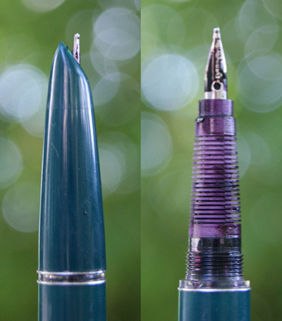
 The grip (more like the whole body) is streamlined and very comfortable to hold, despite it's light weight. There is an clear ring of ink window, which in addition to show case the crappy craftsmanship, also let kind of let you know, right before the ink runs out. So, I find it a little pointless...

The pen has an aerometric converter that's made of a smooth clear sac covered with a metal part (for you to squeeze), it holds quite a bit of ink after a full fill (be sure to squeeze it 3-4 times to minimize air bubble) and actually let you see how much ink is left, once you open up the barrel. 
The black gunk on inside is dried up Noodler's Black...
 Now comes the heart of the pen- the nib. The steel nibs on all three of my Hero 616 is stiff but writes smoothly and evenly on the paper. Smooth is probably not the right word as it gives quite a bit of tooth (and pleasant kind of nice), while at the same time, the nib is wet and lays down an intense (more so than other pens), wet and consistent line. In a way, it feels like writing with a good porous point pen like Sakura Pigma Micron pen.

The stiffness and the tooth are not bad things at all, as it gives sharp shape and form to Chinese character. The characteristic called 出锋 in Chinese (there is no English translation, as such concept doesn't exist in the alphabet). Bottom line, the nib is neither scratchy nor slippery but it's a great writer.
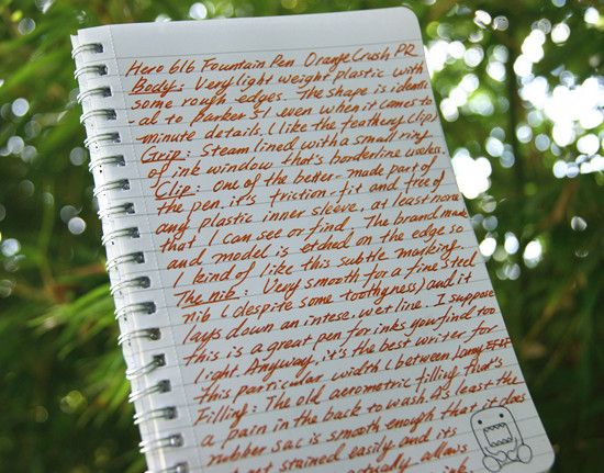
Hero 616 Writing Sample with Private Reserve Orange Crush - a watery ink that bleeds quite a bit on this cheap paper (so each line seems broader the unmarked nib is between a Lamy EF and Lamy Fine). Sometime I just feel like using cheaper paper as the traction makes writing easier (to me, smooth paper + smooth nib = writing on melting snow).
Lastly, something that you can't really escape with a Hero Pen: Quality Control issue. Luckily all three of my pens writes perfectly (something you should not count on if you buy it online). The only dud has a grip section that became loose (it's supposed to glued to the feed) a few days after I got it. When I twist it close completely, the nib becomes misaligned...Now we know what the nib and feed look like.

Overall: Beside the quality control issue (which is pretty big thing for me, as I have rotten luck). Hero 616 is an amazing writer (not just for the price) with an impressive nib. It's a nice little thing to toss in your bag (not entirely sure how reliable it is, ahem) that's also a joy to write with. I have no plan to ditch my other pens for a hundred of these because...A good pen is far more than just a smooth-writing nib.

Tuesday, May 28, 2013

Pilot Custom Heritage 91 Fountain Pen Broad Nib & Tsukiyo Body

I have never exceed in anything in my life: I make pretty lousy grades in school (not even talking about Asian standard...It's a blessing my parents haven't disowned me), I am horribly at coordination (forget about sports, I have never managed a push-up in my life. It's like I push, then nothing comes up...) and my artistic endeavor can't even match the "side hobby" of a typical over-achiever...

However, there is one thing that I kept winning, which is "fun bidding" at eBay:  Every time I see a bidding that seems mildly popular, I would chime in and overbid by what seems like 50 cent (several hours before the auction ends) and guess what? People never bid after that...And that's how I ended up with this pen. 
At a glance, Pilot Custom Heritage 91 Looks quite similar to Sailor Professional Gear with the rhodium trim, flat cap and base and the resin body. The design is simpler and the pen's body is noticeably lighter than my professional gear slim (Sapporo) even though it's noticeably longer (here is a side by side shot).  My first impression is that it's cheaper, bulkier and blander sister of Sapporo. 

Despite the slightly lighter weight, the pen is still solidly built and comfortable to hold. The resin body is reasonably tough and a little more tolerant to scratches than my Sapporo (mainly because the color is not as deep or glossy).
 
Even though the appearance is a bit uninteresting (Sailor nibs are so much prettier) , I was soon won over by the nib. The 14K broad nib is wet, smooth and soft (in a slightly bouncy and gummy kind of way) that makes writing more than just comfortable. It's great at bringing out the shading of inks but I noticed my handwriting look a lot more squiggly and childish while using it.
Close up of the trim. The pen has a screw-on cap and a very secure clip (no slit to caught on to the fiber on my shirt) and it thread on the barrel is also metal-colored (just like Sapporo...See why I don't love it?  It's like an appearance downgrade of a pen I already have and love). Thanks to the longer body, it also takes the bigger Pilot con-70 converter in addition to the squeeze type con-20, piston-fill con-50 and Pilot proprietary cartridge.
Pilot Custom Heritage 91 with Iroshizuku Tsukiyo ink
 Complete written review.  My handwriting prefers steel (or hard) nibs = = ... Overall: Not a fan of the design (I think my favorite looker from Pilot is Prera) but this is just a really reliable and  feel-good writer.
 The compulsory matching photo
 I think this one looks closer to the pen's body

Tuesday, May 7, 2013

Lamy Raspberry Al-Star with J. Herbin Rouge Opera

Lamy Raspberry Al-Star is the special edition for 2009 and it's no longer available in US (some Asian sources said it was made permanent). I was lucky enough to discover one from an England-based eBay seller, who charged...A little less than 30 dollars (international shipping included!) for a brand new one in package (that's cheaper than a special edition Safari!) and since it's the European version, it also came with a silver colored plastic pouch (that I ended up needing).
The Lamy Al-Star is around the same length as a Safari with a slightly chubbier build, the over-all design of the two are the same except Al-Star are smoother (as in, less angular on the edges) and feels more solid on the hand. It's a light weight one for a metal-body pen (it weights less than the resin-body, shorter Sailor Sapporo) but I like how it balances and the brushed-metal, cool-to-the-touch body. 
Like Safari, the Al-Star also has a cap that's denser (with a noticeably bigger weight per unit length) than the body, it not only feels a bit off-balance when posted (I try not to do it since it makes a chalkboard-scratching screech), it's also harder to balance...But I managed! (Maybe I love them because they/the flat bases are the perfect models for my outdoor glamour shots).
The transparent charcoal body show all the capillary and maybe's it's because the ink are evenly distributed (and the top is darkened so I don't see a huge glop of ink accumulated), I am actually not bothered by it. The Lamy M nib is smooth and stiff. Even it's doesn't glide on the paper like a skater, the specific break down of stiff-springiness is very compatible with my handwriting so I keep going back to it. 

Of course, I hate the trigonal grip with a passion (if it's not creating new bumps on my hand, it just cuts skin on my existing one. It's like a daily regional exfoliation on my middle finger). Anyway, I just learned to suck it up since it's part of the attractive design.
I haven't heard many people coveting the Raspberry color, but I find it really unique and magical: It's a pinkish red (well, raspberry pink) but there is also a hint of warm gold tone in the paint, which makes it look like ruby grapefruit under certain lighting. Even though I try to care for the pen like a baby, small scratches and dents still appear on the cap...
The closest match to the pen (in my small collection) would be J. Herbin Rouge Opera: A demurely dusty raspberry pink with medium intensity, decent (there are silkier inks out there) flow and no water-resistance. The writing sample is Olga's Aria from Eugene Onegin, as today is Tchaikovsky's 173th birthday!
The ink writes smoothly and the shading is pretty noticeable with the Clairefontaine paper (but pretty much every ink is, as long as it's not too intense) but I feel that it's a little dry on the normal cheaper paper I use.

Overall: Love them both.