Showing posts with label Blue. Show all posts

Wednesday, April 9, 2014

Prussian Blue - Diamine Ink Review

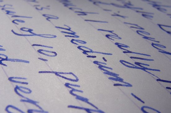
Long time no ink review (well, the sun hasn't been out that often this year). Diamine Prussian Blue is a medium slate blue with a mildly watery consistency. I picked the color because it looks just like the color of the German music publisher G. Henle Verlag (One would always gets some glance of approval from professors/TAs if you carry the blue book around the practice room ). Even without the connection with that prestigious publisher, it still seems like an interesting subdued shade for everyday uses. 
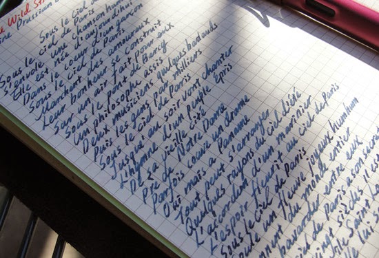
Prussian blue - as with may gray-toned color, is watery, smooth on the paper (Daolin/writes-like-Rhodia refills that fits the bigger Midori traveller's, which btw mine is not...) and shades very well with a Lamy medium steel nib. There is very minimal feathering (on the start of writing which tend to be wetter) and no bleed-through but I guess it would be different on more porous paper. The dry time was ok, maybe within 15 second and the ink withstand like spill of water, just not smear/soak.
Writing sample was Edith Piaf's Under the Parisian Sky (if you Google Parisian sky, most pictures are in this kind of slate blue...and that MAC eyeshadow of the same shade). 

Sunday, January 19, 2014

Sky High - Sailor Jentle Ink Review

Stationery wise, my year of 2014 is off to a lousy start (I bought a Midori traveler's notebook, so I can act all hipster and stuff, then lost it near school before having written/drawn anything on it = =...Oy, FML, FML...). To ease my pain and sorrow, I ordered some Clairefontaine notebooks to use as my art/doodle journals as well as some ink samples. Sailor Jentle in Sky High is one of the five vials I purchased, since nothing lights up my day like a bright blue sky (a whole bucket of ice cream all to myself also helps, so does some cheesy boy band songs from Johnny's).

Sky High is exactly what the name suggested : a gorgeous cerulean with some see-through quality that reminds me of the perfect sky on a perfect day. It's noticeably more subdued and dimmer than my go-to blue (Lamy Turquoise) and makes an interesting yet formal everyday writer.

 On a Lamy Safari Extra Fine nib (I use the one with 2011 Aquamarine body) the flow is excellent (you know how finicky Lamy EF can get) and the shading is apparent. There must bit a tad bit of lubrication, more so than what Diamine ink provides, because the writing didn't seem all that toothy to me. Water resistance is partial as it stay put with a few second of wet rubbing...
There is already a little red-fuchsia sheen to it, imagine it with a dip nib...Anyway, You can get it at Isellpens, Jetpens and some third party Amazon sellers (price around the same once you factor in shipping cost). I might get a bottle as my everyday blue (and use Lamy Turquoise as a summer refreshment) once my sample vial run out.

Friday, August 9, 2013

Pilot Iroshizuku Ink Tsukiyo (Moonlight)

This is a neuron
The best moon picture I can take (with that Sony point and shoot)
Pilot Iroshizuku Tsukiyo (Moon Night/Moonlight, same difference) is a navy blue with a tad of warmth. According to this video (first found on FPN), Tsukiyo is the most-popular shade in Japan. Some categorizes it as a blue-black but on Lamy Safari fine, it get washed down a little to barely-deep blue. 

A quality that I kept seeing in Pilot inks (not just Iroshizuku) is how well they flow and how easy they are to wash off, even on the finest nibs. The water-consistency means that they got suck right into (and feathers a little on) porous paper while having very noticeable shading on glossier paper. 
Another bonus of Tsukiyo is that when used on a very wet nib (Lamy 1.9mm italic), there is a noticeable red sheen on the pooled part. Not the kind that requires you tilt the paper at a specific angle, under certain lighting or at a certain time of the day to be observed. The dry time was quick (by the time I am on the second line in the Rhodia pad paper, the previous one is already dried) and water-resistance is partial.

Scanned written review of Tsukiyo.

Monday, June 17, 2013

M & G Glittery Green Heart Ballpoint Pen

This review won't be all that helpful since the pen was purchased many years ago and only available in China...I just need an excuse to post up the pretty color-matching glamour shots.
A little background of the brand: M & G is a brand founded in Shanghai in 1997, the company was somehow related to the Korean brand Morning Glory (either as a subsidiary or a sister-company) but now it is just going on as its own. The brands makes stationery with cute cartoon figures (I remember there is Miffy the bunny and that blue bear I don't know the name of) and is generally quite affordable, thus popular among school kids.
The little ballpoint pen has a glittery plastic body and a chubby heart clicker. The pen is around the same weight as a Pilot G2 but it's larger in size so I feel it's a little too light for me. It doesn't have a cushioned grip but at least the ribbing makes it easier to hold. 
The pen takes a generic refill (I have a feeling that most finer ballpoint pens in China are like this) that lays down a very smooth, line that's similar to what you get with a 0.38mm gel pen (since the ink is more viscous and doesn't spread out as much). It's generally very smooth for a ball-point (not like Bic at all).

Thursday, June 13, 2013

Lamy Blue Ink Cartridge Review

Most fountain pen lovers should be really familiar with this ink, as it comes with every Lamy Safari/Al-Star/Vista. I never gave it much thoughts initially (mainly because my first Lamy pen had a problematic nibs that too months to break in) but after going through 3 of these, the color actually seems rather easy on the eyes. 

Lamy Blue is a medium-deep (on a broad is much more vibrant and sapphire-like) purple-blue with great flow and very little problem. No bleed through, feathering on most paper and it's rather smooth on the paper for something that flows this well. It withstand some splashes but no soak, faring a little better than J. Herbin in the water-resistance part.
With a fine nib Safari, the shading of Lamy Blue is by no mean remarkable (or noticeable) but every inks shades well with Clairefontaine. Anyway, the color is neutral (as in suitable for everyday use) with a bit of quirk and the unit price is actually pretty good (in bottle form) so I might end up buying a full bottle.

Thursday, May 23, 2013

Diamine Eau de Nil Ink Review

 
All I have is  "Eau de Texas"
Continuing on with the Diamine ink sampling - Eau de Nil is a medium-deep (the shade is on the deep side while the ink has a medium intensity) dusty teal with quite a bit of green to it. The shade is rather moody,  as it reminds me of the cover of Harry Potter and the Order of Pheonix (published by Scholastic. I remember the Canadian one has a different cover illustration that I don't like as much). 
Diamine Eau de Nil with Ohto F- Lapa Fountain Pen
 Like the rest of the Diamine inks I have tried, the flow is good and it write smoothly for an ink with such watery consistency. I experienced a little bleed-through and feathering with Moleskine and cheaper paper but none on Rhodia. Shading is good (only on Rhodia) but for some reason, I prefer it uniformly deep (a sheer layer dusty aqua just makes me uncomfortable). Water resistance is decent as the writing is still legible after a 10-second smear. Basically, the paper falls apart before the writing does.

Overall: A well-behaved ink (most deep ink bleed/feather on cheaper paper anyway). The color isn't quite my thing as I prefer something a little brighter, more opaque and teal that are more blue-toned.
Another picture of the lake, just because...

Friday, May 17, 2013

Lamy Turquoise Bottle Ink

 
I have had Lamy Turquoise Bottle Ink since last September and it has always been inked in one of my rotating pens. The ink is pretty much perfect: The color is rich, intense but not too in-your-face. It flows well and look different (and good) with all nib sizes and  it always writes smoothly on paper. Lastly, the unit price is relatively low for such a good-looking and well-behaving ink.
The spinning-top-shaped bottle is and securely plugged in a ring shaped base, which contains a roll of what blotting paper. It's probably not the most space-conscious design but I found it very sturdy, steam-lined (no paper sticker!) and user friendly (it doesn't spill when I try to open it).
Nice texture nib-wiping tissue that I never use (because I syringe-fill my cartridge and converter) - It would be handy if you want to use it for the nib-creep (doesn't happen with this ink) though. 
Lamy Safari Broad with the Lamy Turquoise Ink - The ink shades from sky (on a perfectly cool and sunny day) blue to lighter aqua, so I find it fitting for fall and cooling for summertime. There is a tad bit of water-resistance so it's OK splash but not soak-able.
Not pictured: On a very fine nib like Pilot Extra Fine (on the Penmanship fountain pen), the color is deeper and much more subdued, almost like a royal blue. I will show that later since the pen is currently filled with something else. Overall: Highly recommended (unless you have a lot of other turquoise).
Matching Object: For the Worshipers by Noh Sang-Kyoon (Taken at Houston Museum of Fine Arts)