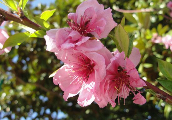
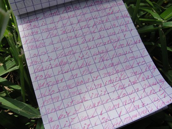
The Sapporo + Fernambuk isn't the best combo out there (ink is too dry for the nib) but I need an excuse to post up this glamour shot so here you go. (One of benefits of stationery-review is that I can always take a gazillion shots after using it, without having to worry about the item looking deflowered. Imagining looking at a close-up of half-used lipsticks...*Shudders* )
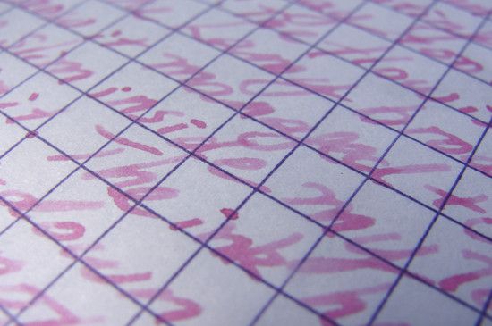
Rohrer & Klinger Fernambuk (must have taken me a whole year to learn how to spell this) is a vibrant Mexican Rose (like the flower worn by Frida Kahlo), it's red and blue (adds up to fuchsia) with a noticeable warm undertone. It looks like a deeper, warmer and more subdued (dusty) take on Diamine Cerise.

Fernambuk is reasonably intense and not that much of a pain-in-the-eyeball. It has a watery consistency that's not at all lubricating with the pen (Sailor Sapporo H-M) so the lines are all dry, Diamine has the same water-yet-doesn't-flow-right-out-of-tine kind of quality but Lamy steel medium nib seem to be more forgiving. Lucikly, the ink doesn't feather much and has tiny bit of water resistance.
Overall: The ink was meh but let's just look at the pretty rose (and bokeh).


