Thursday, May 30, 2013

Galison So Meow Notepad - Inspired by Andy Warhol

From the gift shop of MOMA at Atlanta, Galison So Meow Notepad (they call it mini journal)has a cover art inspired by Andy Warhol's book of 25 Cats Name Sam and One Blue Pussy. I assume the Galison folks just redrew one of the pink-eyed yellow cat on turquoise background.
 
Andy Warhol's quote on the hot pink spine, which would describe my life in a few years *sighs*. The card board cover is thick enough that it survived my 2 years of tossing around (but I am not too far into the pages, since I have too many notepads lying around = = ...) without to much wear-out or bending.
Small writing sample. This is somewhat fountain pen friendly.
Watery inks writes properly on the paper without feathering but there would still be some bleed through when the nib is too hard, pokey or wet. The pages peel away easily but I suppose for a museum souvenir, it's better when everything stay put?
 According to some etailers, there are 160 lined pages in the notepad but there are some graph paper on the back (I didn't bother to count since I already peeled off a number of pages that I don't remember)so I am not sure how they add up.

Overall: For 3 dollars, which is very affordable for a museum gift product (so affordable that it's not gimmicky any more) and the paper isn't bad at all. Well, I suppose if Clairefontaine/Rhodia would do these kind of cute covers on their pads/notebook, they will sure sell like hot cakes.

Tuesday, May 28, 2013

Pilot Custom Heritage 91 Fountain Pen Broad Nib & Tsukiyo Body

I have never exceed in anything in my life: I make pretty lousy grades in school (not even talking about Asian standard...It's a blessing my parents haven't disowned me), I am horribly at coordination (forget about sports, I have never managed a push-up in my life. It's like I push, then nothing comes up...) and my artistic endeavor can't even match the "side hobby" of a typical over-achiever...

However, there is one thing that I kept winning, which is "fun bidding" at eBay:  Every time I see a bidding that seems mildly popular, I would chime in and overbid by what seems like 50 cent (several hours before the auction ends) and guess what? People never bid after that...And that's how I ended up with this pen. 
At a glance, Pilot Custom Heritage 91 Looks quite similar to Sailor Professional Gear with the rhodium trim, flat cap and base and the resin body. The design is simpler and the pen's body is noticeably lighter than my professional gear slim (Sapporo) even though it's noticeably longer (here is a side by side shot).  My first impression is that it's cheaper, bulkier and blander sister of Sapporo. 

Despite the slightly lighter weight, the pen is still solidly built and comfortable to hold. The resin body is reasonably tough and a little more tolerant to scratches than my Sapporo (mainly because the color is not as deep or glossy).
 
Even though the appearance is a bit uninteresting (Sailor nibs are so much prettier) , I was soon won over by the nib. The 14K broad nib is wet, smooth and soft (in a slightly bouncy and gummy kind of way) that makes writing more than just comfortable. It's great at bringing out the shading of inks but I noticed my handwriting look a lot more squiggly and childish while using it.
Close up of the trim. The pen has a screw-on cap and a very secure clip (no slit to caught on to the fiber on my shirt) and it thread on the barrel is also metal-colored (just like Sapporo...See why I don't love it?  It's like an appearance downgrade of a pen I already have and love). Thanks to the longer body, it also takes the bigger Pilot con-70 converter in addition to the squeeze type con-20, piston-fill con-50 and Pilot proprietary cartridge.
Pilot Custom Heritage 91 with Iroshizuku Tsukiyo ink
 Complete written review.  My handwriting prefers steel (or hard) nibs = = ... Overall: Not a fan of the design (I think my favorite looker from Pilot is Prera) but this is just a really reliable and  feel-good writer.
 The compulsory matching photo
 I think this one looks closer to the pen's body

Thursday, May 23, 2013

Diamine Eau de Nil Ink Review

 
All I have is  "Eau de Texas"
Continuing on with the Diamine ink sampling - Eau de Nil is a medium-deep (the shade is on the deep side while the ink has a medium intensity) dusty teal with quite a bit of green to it. The shade is rather moody,  as it reminds me of the cover of Harry Potter and the Order of Pheonix (published by Scholastic. I remember the Canadian one has a different cover illustration that I don't like as much). 
Diamine Eau de Nil with Ohto F- Lapa Fountain Pen
 Like the rest of the Diamine inks I have tried, the flow is good and it write smoothly for an ink with such watery consistency. I experienced a little bleed-through and feathering with Moleskine and cheaper paper but none on Rhodia. Shading is good (only on Rhodia) but for some reason, I prefer it uniformly deep (a sheer layer dusty aqua just makes me uncomfortable). Water resistance is decent as the writing is still legible after a 10-second smear. Basically, the paper falls apart before the writing does.

Overall: A well-behaved ink (most deep ink bleed/feather on cheaper paper anyway). The color isn't quite my thing as I prefer something a little brighter, more opaque and teal that are more blue-toned.
Another picture of the lake, just because...

Monday, May 20, 2013

May Sightings - Notebooks and Journals at Target

Just spotted these cute notebooks/journals at Target over the weekend (let's assume that they are not fountain pen friendly).
  Mickey Mouse!
Interesting texture on this peacock feather one 
I was hoping that the Doodle the Day Away one would come with blank page (for doodling/drawing) but it's still line.

Friday, May 17, 2013

Lamy Turquoise Bottle Ink

 
I have had Lamy Turquoise Bottle Ink since last September and it has always been inked in one of my rotating pens. The ink is pretty much perfect: The color is rich, intense but not too in-your-face. It flows well and look different (and good) with all nib sizes and  it always writes smoothly on paper. Lastly, the unit price is relatively low for such a good-looking and well-behaving ink.
The spinning-top-shaped bottle is and securely plugged in a ring shaped base, which contains a roll of what blotting paper. It's probably not the most space-conscious design but I found it very sturdy, steam-lined (no paper sticker!) and user friendly (it doesn't spill when I try to open it).
Nice texture nib-wiping tissue that I never use (because I syringe-fill my cartridge and converter) - It would be handy if you want to use it for the nib-creep (doesn't happen with this ink) though. 
Lamy Safari Broad with the Lamy Turquoise Ink - The ink shades from sky (on a perfectly cool and sunny day) blue to lighter aqua, so I find it fitting for fall and cooling for summertime. There is a tad bit of water-resistance so it's OK splash but not soak-able.
Not pictured: On a very fine nib like Pilot Extra Fine (on the Penmanship fountain pen), the color is deeper and much more subdued, almost like a royal blue. I will show that later since the pen is currently filled with something else. Overall: Highly recommended (unless you have a lot of other turquoise).
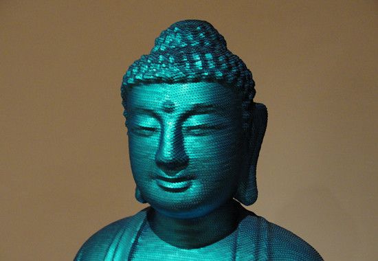
Matching Object: For the Worshipers by Noh Sang-Kyoon (Taken at Houston Museum of Fine Arts)

Thursday, May 16, 2013

J. Herbin Refillable Roller Ball Pen

(So here is a review without writing sample) J. Herbin Refillable Roller Ball Pen is a light-weight and short (just a bit longer than Pilot Petit) pen that takes standard international cartridges. I caught the nifty little thing at ISellpens.com when it was on sale for 6 bucks but it went back to $9.6 (so the seller that offers the best deal right now is Jetpens).

The pen is is a made of a slightly frosted plastic, it would take some degree of abuse (without showing too much of the wear and tear), the clip is pretty stiff and cap gives a crisp and secure click closure. There is three small holes at the end of the barrel so you need to get those taken-care of before converting the pen into an eye-dropper. 
The grip section is made of a clearer plastic that shows the feed. Inside the feed,  there seems to be a white cotton cord for the ink to diffuse through (it later got clogged by Noodler's No.41 brown, a ink with pigment that settles into small flakes).

There is a protruded ring (probably there so the tip will fit the inner sleeve inside the cap) that cuts my hand a little, but it wasn't too big of a deal (at least I prefer this over the trigonal grip). Bumped or not, prolonged writing session is not as comfortable since the pen is a bit too light, as I prefer heavier one that rests by itself.

When I first got the pen, I intend to use it with a waterproof brown ink, as a cheaper alternative to buying the brown Sakura Pigma Micron. Syringe-filled with Noodler's No.41 Brown (the culprit), it worked pretty well during the first few days, laying down a consistent and thin (around 0.5mm) line with a bit of shading...Then it just got clogged. I tried to revive it with flushes and days of (just water) soaking but it has never been the same...

Verdit: It's a good pen (while it lasted), just play safe and use watery inks for it.

Tuesday, May 14, 2013

Rhodia Meeting Book 90

 Rhodia recently released a new Meeting Book 90, a note jotter "invented (more like designed?) by a CEO for his personal use". I was lucky enough to win one from Rhodia's blog giveaway so here is my review for it.
Just like the existing Rhodia A4/A6 meeting book, it comes with 80 pages of pre-printed paper but this uses 90g  (instead of 80g) paper. As a given, the paper is smooth a dream canvas for fountain pen users: No feathering or bleed through and it brings out the shading in most inks.
 
Even with a wet-broad - The show through is minimal.
 Beside the pre-printed Date/Note/Action, each page is micro-perforated "for easy and clean removal". Since the paper itself is relatively thick, the removal is clean but I find it much easier and quicker to just rip the page from the spiral.
 
One should never judge a (meeting) book by its cover so I save it for the last (And no, it wasn't chewed by a dog). From the short online research I have done, it seems that the another new feature of the Rhodia Meeting Book 90 is the ribbed pattern on the black polypropene cover, a subtle make-over from the bland version. The ribbage looked rather handsome when I first got it (If it were a human, it would be named Don Draper) but after a few days, I started noticing white flakes on it.
  Initially, I thought it was drool (God knows how it got there...) and went ahead and tried to scratch it off. Then I realized that the textured ribs, which seem to be made of a waxy coating, are flaking off with small amount of friction. It might not be that big of a problem, if you only use it during meetings and have it kept inside a tidy drawer. I generally don't babysit my stationery so I prefer something that's lower-maintenance . 

Overall: I love the paper and binding but the new ribbed design is nuisance that I can't quite ignore. I am hoping that after a few more toss-in-the-bag, the coating will flake off completely (so it look like the older meeting book, just with better paper).

Wednesday, May 8, 2013

Tchaikovsky - De Atramentis Ink Review

De Atramentis Tchaikovsky is a charcoal with a cool undertone, it's neither blue nor purple so I supposed their description of "silvery grey" is fairly accurate) . The color not only reminds me of the silvery mane of the young-and-dashing Dmitri Hvorostovsky,  it also captures the grave-majesty and moodiness of his music pretty well, at least better than the magenta thing by Noodler's... 
It looks like it's having crazy shading ability but the thing is that, every ink shades and flows smoothly with the juicy broad nib (on Pilot Custom Heritage 91) on Clairefontaine paper. On normal paper and fine nib, it's more of a (dare I say, uninteresting?) water-downed black. Anyway, the ink is well-behaved and has 50% water resistance during a smear test, the top of the color dissolves but the line was still visible. 
Overall: If you like a black ink with some shading, this would get the job done as long as you have the right type of pen and paper. I am still not sure what I think about it. Too boring? A little off-season for the current weather? Anyway, it looks like the color would go really well with the new matte black Lamy Al-Star...

P.S. The writing sample is Tatiana's Letter in Pushkin's Eugene Onegin (English translation /opera adaptation by Tchaikovsky). My favorite interpretation is actually by the young Galina Vishnevskaya (who sounds more like a passionate young girl than an "opera diva" there) but there isn't a video footage of that.

Tuesday, May 7, 2013

Lamy Raspberry Al-Star with J. Herbin Rouge Opera

Lamy Raspberry Al-Star is the special edition for 2009 and it's no longer available in US (some Asian sources said it was made permanent). I was lucky enough to discover one from an England-based eBay seller, who charged...A little less than 30 dollars (international shipping included!) for a brand new one in package (that's cheaper than a special edition Safari!) and since it's the European version, it also came with a silver colored plastic pouch (that I ended up needing).
The Lamy Al-Star is around the same length as a Safari with a slightly chubbier build, the over-all design of the two are the same except Al-Star are smoother (as in, less angular on the edges) and feels more solid on the hand. It's a light weight one for a metal-body pen (it weights less than the resin-body, shorter Sailor Sapporo) but I like how it balances and the brushed-metal, cool-to-the-touch body. 
Like Safari, the Al-Star also has a cap that's denser (with a noticeably bigger weight per unit length) than the body, it not only feels a bit off-balance when posted (I try not to do it since it makes a chalkboard-scratching screech), it's also harder to balance...But I managed! (Maybe I love them because they/the flat bases are the perfect models for my outdoor glamour shots).
The transparent charcoal body show all the capillary and maybe's it's because the ink are evenly distributed (and the top is darkened so I don't see a huge glop of ink accumulated), I am actually not bothered by it. The Lamy M nib is smooth and stiff. Even it's doesn't glide on the paper like a skater, the specific break down of stiff-springiness is very compatible with my handwriting so I keep going back to it. 

Of course, I hate the trigonal grip with a passion (if it's not creating new bumps on my hand, it just cuts skin on my existing one. It's like a daily regional exfoliation on my middle finger). Anyway, I just learned to suck it up since it's part of the attractive design.
I haven't heard many people coveting the Raspberry color, but I find it really unique and magical: It's a pinkish red (well, raspberry pink) but there is also a hint of warm gold tone in the paint, which makes it look like ruby grapefruit under certain lighting. Even though I try to care for the pen like a baby, small scratches and dents still appear on the cap...
The closest match to the pen (in my small collection) would be J. Herbin Rouge Opera: A demurely dusty raspberry pink with medium intensity, decent (there are silkier inks out there) flow and no water-resistance. The writing sample is Olga's Aria from Eugene Onegin, as today is Tchaikovsky's 173th birthday!
The ink writes smoothly and the shading is pretty noticeable with the Clairefontaine paper (but pretty much every ink is, as long as it's not too intense) but I feel that it's a little dry on the normal cheaper paper I use.

Overall: Love them both.

Sunday, May 5, 2013

Pentel Stylo Sketch Pen

Pentel Stylo Sketch Pen was another clearance finds from Target (reduced to $1.5 from 3), it's a porous point pen with and interesting pencil-like tip that's looks sharpened. The pen's body is light-weight, plain and not too scratch-prone (Hello, Sakura pigma sensei...) the clip is firm/secure and the half-cylindrical half-conical grip is pretty comfortable. In theory, the pen should be a dream sketch combination of pencil and pen but it's not quite my cup of tea.
As a pseudo-pencils, the slightly bouncy tip does offer some swift strokes (that makes you feel somewhat spontaneous) and subtle line variations. I notice that the white triangular base and the tip kind of get in the way when I want to get a finer line. First, the white part blocks my view of what's about to be drawn and unless I am very careful (drawing super slowly and maintain a near 90 degree angle), the slanted side of the black triangular tip always manages to spill ink on the paper. 

It's kind of like drawing with bouncy bristle (such as toothbrush), even though the tip is the only part that's making contact, you always get some spill from the ink droplets that get shaken off from the rest of the bristle. The droplets from this particular pen pen is small (positively smudge-like), uncontrolled and hardly artistic.
As a pen, it was fairly nice and inky (for the first few uses...now it's a bit dry) and the ink is an intense teal-black. There is only partial water-resistance so adding watercolor will mess up the whole drawing (you an add water to shade it though). I suppose there must be people who like this kind of effect but personally, if I want some mild variation (minus the spilling!) with minimal water-resistance, I will just go for fountain pen and a normal black ink.

Overall: It's a cool concept (for a gimmick) that didn't work out.