Showing posts with label 14K Nib. Show all posts

Tuesday, September 1, 2015

Pelikan Souveran M400 White Tortoise - Broad Nib

"Wait. You bought half a ski worth of pen!?"  
That was the reaction from my friend/temporary roommate(who bought a whole ski around the same time, huh huh.)when I confessed to her my darkest secret. By the way, I did so with a happy and smug face, just like her dog/roommate no.2 when she ate my lunch/chewed up my makeup brush.

I have owned and used this pen for almost 9 months already and I guess it's time for a short review.
 
Pelikan M400 White Tortoise is one of the pens that had been on my list forever, and as soon as I got my second paycheck from my grown-up job (the first/ the whole thing,  was to take care of the rent and deposit. The joy of living in New York area), I went online and hunted this baby down.

The reason of my strong desire is quite apoarent: Look how pretty and shiny it is!

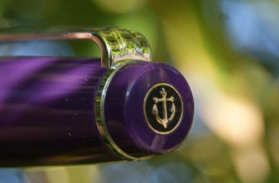
There are plenty of pictures of the white tortoise on the net so I won't go all spammy: In real life, it's just as beautiful (as it was in my day dream). The white pen has a simple design with gold accent.

The acrylic barrel, where most ooh-and-ahh is induced, has warm toned striations that glitter and flicker under sun. This kaleidoscope-like beauty is further enhanced with inks in shades of yellow, amber and orange. 
The grip section of the M400 is short but long enough to rest on my finger without running into the thread. Anyway, the well-balanced pen is lightweight enough that it wouldn't cut into skin even I am holding onto the thread. 

For the nib, I picked up a broad (mainly because my appetite for pin-point precision can be fulfilled by the Japanese). It's less stiff than the 14k from Sailor but a tad springy than the stainless nib from Lamy. It writes well, in a smooth and sheer way that showcases shading in lighter ink but admittedly, I can't say it's better writer than pens in cheaper price brackets.
Writing sample with Diamine Jade Green on Muji grid notebook. It took me months to use up the barrel full of ink now that I no-longer have notes to take and my actually handwriting has to be done with ballpoints. The horror.

Overall: It's a beautiful pen and a decent writer. I can't say it's worth all the Benjamins but it has been making me really happy. If you want a more expensive pen with a solid performance and tangible craftsmanship, I think a Pilot pen in the 100-dollar range will bring you more joy.

Tuesday, May 28, 2013

Pilot Custom Heritage 91 Fountain Pen Broad Nib & Tsukiyo Body

I have never exceed in anything in my life: I make pretty lousy grades in school (not even talking about Asian standard...It's a blessing my parents haven't disowned me), I am horribly at coordination (forget about sports, I have never managed a push-up in my life. It's like I push, then nothing comes up...) and my artistic endeavor can't even match the "side hobby" of a typical over-achiever...

However, there is one thing that I kept winning, which is "fun bidding" at eBay:  Every time I see a bidding that seems mildly popular, I would chime in and overbid by what seems like 50 cent (several hours before the auction ends) and guess what? People never bid after that...And that's how I ended up with this pen. 
At a glance, Pilot Custom Heritage 91 Looks quite similar to Sailor Professional Gear with the rhodium trim, flat cap and base and the resin body. The design is simpler and the pen's body is noticeably lighter than my professional gear slim (Sapporo) even though it's noticeably longer (here is a side by side shot).  My first impression is that it's cheaper, bulkier and blander sister of Sapporo. 

Despite the slightly lighter weight, the pen is still solidly built and comfortable to hold. The resin body is reasonably tough and a little more tolerant to scratches than my Sapporo (mainly because the color is not as deep or glossy).
 
Even though the appearance is a bit uninteresting (Sailor nibs are so much prettier) , I was soon won over by the nib. The 14K broad nib is wet, smooth and soft (in a slightly bouncy and gummy kind of way) that makes writing more than just comfortable. It's great at bringing out the shading of inks but I noticed my handwriting look a lot more squiggly and childish while using it.
Close up of the trim. The pen has a screw-on cap and a very secure clip (no slit to caught on to the fiber on my shirt) and it thread on the barrel is also metal-colored (just like Sapporo...See why I don't love it?  It's like an appearance downgrade of a pen I already have and love). Thanks to the longer body, it also takes the bigger Pilot con-70 converter in addition to the squeeze type con-20, piston-fill con-50 and Pilot proprietary cartridge.
Pilot Custom Heritage 91 with Iroshizuku Tsukiyo ink
 Complete written review.  My handwriting prefers steel (or hard) nibs = = ... Overall: Not a fan of the design (I think my favorite looker from Pilot is Prera) but this is just a really reliable and  feel-good writer.
 The compulsory matching photo
 I think this one looks closer to the pen's body

Friday, February 8, 2013

Sailor Professional Gear Slim Fountain Pen - Purple Body

After having purchased several budget-range fountain pens from Pilot, Lamy and Ohto, I reckoned I have played around enough and it was time to venture into the standard price zone (100 dollars is "standard"...according to FP geek. What have I gotten myself into...) More specifically, pens with gold nibs. 

 At first I was thinking about the ones by Hero but I wasn't too crazy about the appearance, not to mention I have been a little wary of Chinese pens, from my past experience (Long story short: Got five Chinese pens for the past 8 months, none of them writes properly, three of them just would not write period). In the end, I decided to settle for a Sailor, as I always have a thing for their nibs...
I ended up getting a Sailor Professional Gear Slim Fountain Pen (aka Sapporo) with purple body and 14K hard-medium nib (as a Christmas present to self). As soon as I opened the cushioned navy colored box, I was transfixed by the its beauty: Glossy purple body, delicate rhodium trim (I just don't like gold) and look at the etching on the nib! The first impression was wonderful as this was/is everything I imagined an "expensive" pen to look like.
On the top of the cap, there is their signature anchor, which seems to be made of metal and filled with black lacquer. It's the perfect finishing touch for the whole design and I can't find a better way to place the brand logo. The clip is rather firm and has a small slit-like seam at the bottom, which can catch on some loose thread and break them as you pull the pen out. Thanks, I now have hole on my shirt and fiber stuck on the grip.