I soon ended up with a whole bottle from Amazon, under the impression that it would evoke some nostalgia or at least some sentiments. I mean, even if it's not traditional Chinese inspired (you can call that oriental?), a bloody ink still sounds bloody wicked.

The packaging is standard Noodler's (with 3oz bottle that's filled to the brim). Right below the brand name, there is a line that reads "One day, China
will be free!" I find the familiar expression a little patronizing, like "One day (insert name of third
world country here) will be liberated by us American".
They can't
just say something like "Never Forget", "Make the Government Apologize",
anything that doesn't remind people of The White Man's Burden? The writing of "The most auspicious of color" (right under Made it USA) also kind of lost me, the color of the ink is not remotely lucky in a Chinese Feng Shui sense so I suppose it just means it's auspicious for the American (in their effort to free the "suffering Chinese") ? Ouch, thank you very much, my American friends!

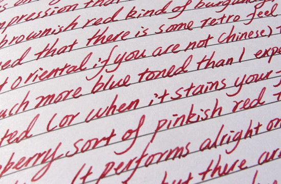
Tiananmen behaves differently on different pens: On fine nib (Asian fine/extra fine) sizes that lay down a solid line, it appears true to its burgundy shade, on anything that offers a broader and spread-out line, it can either look like a watered-down muddy pinkish red (Lamy Safari F) or a slightly brighter raspberry red (Sailor Sapporo M).
 |
| Noodler's Tiananmen with Sailor Sapporo Medium Nib - Pressure exerted constantly as I write. |
Intensity/Shading: Again, this depends on the pens but overall, it has a medium to somewhat high opacity and the shading is noticeable, just not a defining quality of the ink. Personally, I wish it a little more intense.
Flow/Lubrication: On finer nibs like Pilot fine, extra fine (and even Sailor Medium) it seems so dry that I need to actually put pressure on the nib to get an even line. On Lamy fine it writes properly but I don't like the muddy-pink-red it comes out as. After many tries, I found that the only nib/pen in my collection that work with this are the Ohto F-Lapa and F-Spirit (they have the same nib and possibly the same feed), both lay down a solid burgundy line (Iff, freshly inked and used consistently).
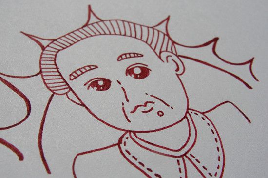 |
| With Ohto F-Lapa Fountain Pen on cheap sketch book from CVS - Chairman Mao is not impressed |
Dry Time: On paper (especially smoother one such as Clairefontaine) it takes a good 20-30 seconds to dry comepletely, similar to Noodler's black. However, the dry time inside a pen is impressive, the nib drys out if it's not used for 2-3 days.
 | ||||
| Tiananmen with Sailor Sapporo- Normal writing (no pressing). See how dry and muddy the lines look? |
Feathering/Bleeding: As long as I am not using those fibrous cheap paper (that CVS sketch book) or pressing too hard, there would be little to no bleed through or feathering. The catch: It's so dry that I kind of had to press hard so show-through is almost inevitable.
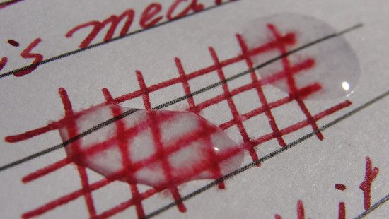
Water Resistance: Half of the color survived the drip test (so your handwriting could be still legible after some contact with water) but I doubt it would make it through a soak.
Lesson learned, I will be sure to stick with their standard bulletproof range and steer clear of all the special editions (their latest Qin Shi Huang, an acidic red that flashes under UV, has gimmicks written allover it).

Complete hand-written review of Noodler's Tiananmen
I am always intrigued by Noodler's naming scheme, but after BSB, I am hesitant of getting another Noodler's. Does the red have a golden sheen after it dries? I love that aspect of red/magenta colors.
ReplyDeleteNope, no sheen at all (this is what made me think I should have gone with Sailor Grenade instead...I like the color of garnet and pomegranate)just a nice, rich burgundy while it works.
DeleteTiananmen didn't really stain but it takes longer to wash off (most red are like this?). I started to think that all these special edition are gimmicks after I went to a pen store to get the thought-after limited-run Texas Blue Bonnet, the owner told me "We ran out but bad blue heron looks just like it".
Another instance was the Russian figures ink they do, they picked a bright-lavender for Tchaikovsky (is it a poke at his sexual orientation, I see nothing flashy in his music?) and magenta for Rachmaninoff...
I thought picking one for Rachmaninoff is a piece of cake (if he doesn't pick anything dark and gloomy) because most people (who did some research) would make a connection between the composer and lilacs (the song he wrote during honey moon and the mysterious bouquet that shows up in his concerts)! Yet...they went with magenta...
Of course he can pick whatever color he wants but that makes the naming totally random and gimmick-oriented.
Another red with lovely sheen is J.Herbin Hematite. Not a typical J. Herbin ink, it is rich and intense. At certain angle, you can see the sparkle.
DeleteMost musician inspired ink is a bit random. De Atramentis put one out a couple years ago, and I seriously think it is just relabeling of its existing ink. I would not associate Rachmaninoff with magenta, even if they are going after the darker pieces. But oh well, maybe we should ask them for an explanation :p
I actually fell for the De Atamentis gimmick (I mean, I was listing to Queen of Spade and I reckon I could use a dark charcoal...Bach was a nice dusty purple). I think they are just playing the card that fountain pen users have a bigger likelihood to like classical music (as they are both somewhat detailed and old-fashioned?), which seems like a smart move to me (at least I buy it).
DeleteI got Beethoven from De Atramentis, not exactly the color I would associate with Beethoven (a chocolate brown), but at least it is a nice hue. That might be the reason why that I am not enthusiastic about Diamine's music ink.. might be the same!
DeleteWell, Diamine Tchaikovsky has a coppery sheen (and both Chopin and Schubert are colors I could get a lot of use for) so I want to try them...I am just not sure if they sell those separately (I am not interested in other warmer tones...Or Wagner aka pickle juice).
DeleteSurprisingly, I have found out that many people dislike Wagner... besides the pickle juice colored ink.
DeleteOh, is that why there isn't a Wagner rip-off edition fountain pen for his bicentennial?
DeleteI haven't heard enough (it's weird listening to opera when I am completely clueless about the language) Wagner to dislike his music I always assume that the general public must love him...Since so many Star War fans love that theme/Valkyrie thing he wrote. Anyway, I have encountered a really obnoxious fan of his in a forum, that kind of put me off...
Nice, I was curious about this colour (and Habanero... but I think that one is more orange). This would be amazing if it had a sheen on it! Nevertheless, I am almost out of my current red (Noodler's Fox Red) so I'm hunting for another nice red, aside from Rouge Hematite. Nice review, thanks!
ReplyDeleteBeside the naming (more like the labeling) irked me a bit, I suppose there is nothing wrong with the color itself. It's dark and subdued enough for note-taking and drawing. So far most of the reviews on this have been positive (though the dryness was mentioned)so I guess it's still worth sampling?
Delete