Thursday, February 28, 2013

Inked This Month - Feburary 2013

I usually consume 1-1.5ml (a cartridge-full) of ink each week so every month, I (try to) limit my inked pen to four instead. In that way, I will get some variation (in addition to the porous-points and gel-pens tossed in my bag) while also each pen would get its time to shine.
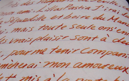
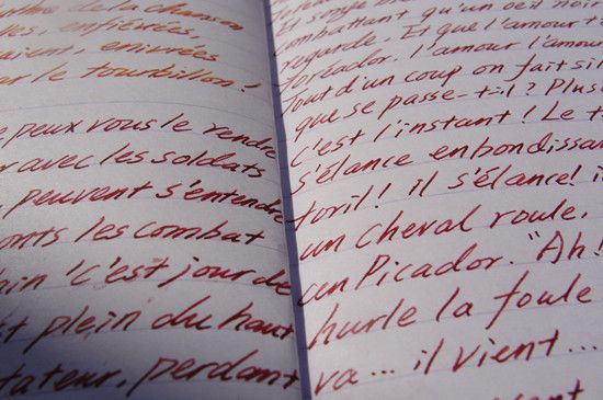
J Herbin Refillable Rollerball - Noodler's No.41 Brown
Even though it's a little too light to be held for a long while, the pen lays down a smooth and even 0.5mm line (I actually don't care about line variation) and the ink is a warm sepia that appears orange in a bigger pool.
Lamy Safari F- Noodler's Bulletproof Black
A reliable combo for daily writing. I love the no-frill, well-behaved ink but I don't think I want to use it on any pen that's remotely expensive.

Pilot Custom Heritage 91 B - Lamy Turquoise
The combo is a killer shader (Ok, the broad is a little too thick for casual use/my handwriting).

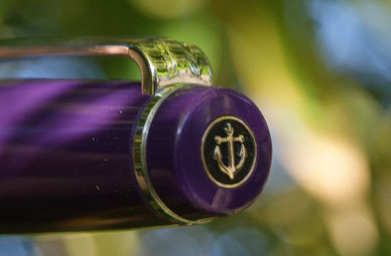
Sailor Sapporo H-M - Diamine Violet 
Another reliable daily writer (the construction is more solid and the nib is smoother compared to Lamy fine). I mainly ink it with better-flowing ink that are easier to clean.
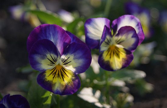
A close up of the J. Herbin Rollerball Pen. I haven't used it for four days and it's already dried up (it didn't start dry, it simply stopped working). I know Noodler's bulletproof inks stain the inside of the barrel (converter and ink vial) but I didn't know this would clog up the pen this quickly. I guess the ink has bonded with the cotton (or whatever material it is) cord inside the pen as it dries...Let's hope I can revive it with a wash.

Wednesday, February 27, 2013

Violet - Diamine Ink Review

Violet flowers - I think these are called field pansy
Color/Intensity - Diamine violet is a medium-deep purple with a bit of a blue lean. As it's drying, the ink shifts from a mid-tone purple to a slightly fainter blurple (and stays that way), not unlike the gradation on the field pansy. The color is not too bright, deep enough to be easily legible but it doesn't have inky/blackened quality to it.

Shading- with a medium nib (Sailor Sapporo H-M, which kicked Lamy F out and became my default writer) the shading is noticeable but just not in a mind-blowing way (purple-blue shift doesn't count). 

I suppose everything shades better with broad/wet/italic nib but I personally like using fine-medium for ink review. Not only they happened to be my most-used nib, they are also pickier on the inks.

Monday, February 25, 2013

Michael's - Mini Masking Tape Heaven

Apparently, there are more masking tape at Michael's and almost half of them are on clearance.
Gingham check, arrow and stripy ones 
Polka dost an plaids
Cameo, music score and antique/film print
Spring and picnic-y ones
More stripe and hound tooth. I was already overwhelmed that I still don't know what to pick (good thing for my wallet, I guess).

Thursday, February 21, 2013

Inky Treats from the Goulet and ISellPens

I was opposed to buying sample because I didn't like the higher unit price (and I am that kind of person who loves the bottle aspect of bottled ink) but recent experiences tell me that it would be much more expensive to be stuck with 89 ml of ink that I don't like...So, I went on a mini ink binge, from two FPN-reputable sellers,  Goulet Pen and ISellPens.com.
 Sample from Goulet Pen Company - Store based in Ashland, VA

Monday, February 18, 2013

Clairefontaine Collection 1951 Notebook Red Coral

Back in January, Quo Vadis Blog hosted a giveaway for the smaller Clairefontaine collection 1951 notebook, I ended up being one of the 33 lucky winners. A few days after the announcement, this little notebook arrived in my mail (courtesy of Sunny from Exaclair).  Look, they even picked the one in red coral, which is my favorite color when it comes to lip products!
The smaller size measures 9x14cm ( 3 1/2 by 5 1/2 inches) and contains 64 pages bonded by staple (that I can't see or feel), according to most sellers. The cover is harder paperback and has a nice texture on it. The color actually gets rub off somewhat easily (if you just toss and let it roll in your bag) so I seal the hinge and sides with some clear packaging tape instead.

Many have raved about the Clairefontaine paper so I will try to keep it short: The 90gm paper is thick-enough (with barely any show through), smooth (not in a waxy-film kind of way) and shows the shading of inks wonderfully. The dry time on this paper is slightly longer (compared to cheaper, more fibrous ones) but that's to be expected.
The smaller size is perfect for poems. Since I haven't memorized any aside from the ones sung in choir, I use it to write down opera arias (The above writing was Seguidille from Carmen) I like. I also use it to jot down to-do, to-draw and what-should-I-buy-next lists. Maybe I should get another one as a flash-card type of notebook, since the bright coral gives me good mood whenever I take it out.
Obligatory Plug - Seguidille performed by Agnes Balsta

Writing was the Bullfighter's Song. Smudges courtesy of Noodler's Tiananmen.

Overall: I really love it and 3 dollars is such as great price for it. Now I just need to find some translucent plastic paper to wrap it (Back in elementary school in China, I used that to wrap the book I want to care for, like a baby).

For the interested:  You can buy them at Isellpens (where I ordered another one from) , Goulet and Jetpens.

Sunday, February 17, 2013

Noodler's Tiananmen Fountain Pen Ink

Tiananmen, one of Noodler's so-called controversial releases, is named after the Tiananmen Square incident happened in June 4th of 1989. The first time I heard about the ink, it seemed like an instant must-buy as name was too funny (it's like a classy way of saying "CCP, in your face!")  and the descriptions "rich, blood-mixed-with-dirt" was deliciously intriguing to me, when I read the various blog/forum reviews.

I soon ended up with a whole bottle from Amazon, under the impression that it would evoke some nostalgia or at least some sentiments. I mean, even if it's not traditional Chinese inspired (you can call that oriental?), a bloody ink still sounds bloody wicked.
The packaging is standard Noodler's (with 3oz bottle that's filled to the brim). Right below the brand name, there is a line that reads "One day, China will be free!" I find the familiar expression a little patronizing, like "One day (insert name of third world country here) will be liberated by us American". 

Thursday, February 14, 2013

Fountain Pen - Five Reasons Why I Love You

 It's that time of the year again (the day before candy/chocolate clearance!) so here is a pictorial love letter to my semi-faithful, longish-time (well, it did start back when I was in grade school) companion, fountain pen. Here are five (of the many) reasons why I love you so much:

Friday, February 8, 2013

Sailor Professional Gear Slim Fountain Pen - Purple Body

After having purchased several budget-range fountain pens from Pilot, Lamy and Ohto, I reckoned I have played around enough and it was time to venture into the standard price zone (100 dollars is "standard"...according to FP geek. What have I gotten myself into...) More specifically, pens with gold nibs. 

 At first I was thinking about the ones by Hero but I wasn't too crazy about the appearance, not to mention I have been a little wary of Chinese pens, from my past experience (Long story short: Got five Chinese pens for the past 8 months, none of them writes properly, three of them just would not write period). In the end, I decided to settle for a Sailor, as I always have a thing for their nibs...
I ended up getting a Sailor Professional Gear Slim Fountain Pen (aka Sapporo) with purple body and 14K hard-medium nib (as a Christmas present to self). As soon as I opened the cushioned navy colored box, I was transfixed by the its beauty: Glossy purple body, delicate rhodium trim (I just don't like gold) and look at the etching on the nib! The first impression was wonderful as this was/is everything I imagined an "expensive" pen to look like.
On the top of the cap, there is their signature anchor, which seems to be made of metal and filled with black lacquer. It's the perfect finishing touch for the whole design and I can't find a better way to place the brand logo. The clip is rather firm and has a small slit-like seam at the bottom, which can catch on some loose thread and break them as you pull the pen out. Thanks, I now have hole on my shirt and fiber stuck on the grip.

Wednesday, February 6, 2013

Green Inspired Cityscape Pocket Notebook

With an unassuming price tag of 3 dollars and a stylish design, it didn't take long for the Green Inspired Cityscape Notebook Set to catch my eyes while I was doing my window shopping at Target. Instead of hauling it right on the spot, I decided to go home and searched for some reviews instead (proud dumb-phone user here).
 
Anyway, I managed to find one review on Target's site and luckily for me (so I thought), the customer mentioned that the paper quality is nice and totally fountain pen compatible. According to him/her, it only shows skipping on very broad nib. After I read the review, I did a mini victory dance and bought the set a few days later. "They are cute, affordable and comes with nice paper...This must be my lucky week" I thought as I picked it up.
The notebooks came wrapped with clear plastic. The one with Big Ben is on the top so it was subjected to some scratches due to handling (all of the stock are like this). It's a shame since I like this deep navy cover the best. On a completely unrelated note: If I were to assign the color theme, I would give London a gray cover, Paris would be dusty purple taupe (like Rue de Paris; Temps de pluie) and New York would be deep navy. (Bright red would be Moscow and lime green would be Miami.)
The notebook are sewn bind (28 pages per notebook) and made of environmental-friendly (recycled and printed with soy-ink, which made it smell funky) paper. As you can see, the thread has a tendency to come of (in at least one of the three) and all of the blue ones (that I checked) have shown some tear. I am not sure what is going on there...
The material of the cover is really nice- Like a cardboard-plastic hybrid (with a leathery pores) - The interior is a lighter shade of blue (or maybe turquoise) depicting...I am assuming this is the map of the London underground? All three are like this which is an interesting touch. Now to the amazing, smooth and fountain-pen compatible paper. Wait a minute...
What are those blue dots? Bleed-through! My guess is that there must be some discrepancy between my and the Target guest reviewer's definition of compatibility because the paper was positively difficult for my fountain pens to write on (Pilot extra fine + Noodlers, Sailor Medium + J. Herbin, Pilot Broad with Lamy...none worked). The paper, as smooth as it feels, seems to have an ivory-toned waxy coating on it that water-based inks simply wouldn't go on...Well, it does write but you can see the half of the writing is made up of microscopic skipping. When I press a little harder than usual for the ink to go on, I get a good deal of bleed through...
Beside fountain pens, Marvy LePen also looks (the first chunk was written with the one in teal) funny/ much fainter on the paper. On the other hand, all of my gel pens worked fine on the paper so...I guess the "fountain-pen friendly" paper is just hydrophobic?

Overall: Nice design, great price and very handy for jotting down small ideas you have. Beside the the misunderstanding about the fountain pen part, I still like them and would recommend them to gel-pen users. (On a side note, many "green" recycled paper are like this...I find it a little ironic how the environmental-friendly paper only works with disposable pens).

P.S. The writing sample is the lyrics of a J-pop song, click here to see the video. (Now excuse me while I squee like a pre-teen Belieber >_< )